How to Plot with Python: 8 Popular Graphs Made with pandas, matplotlib, seaborn, and plotly.express
I’m teaching a course about the essential tools of Data Science at Nuclio Digital School. Among other topics, I planned to go through the most popular data visualization libraries in Python: pandas, matplotlib, seaborn, and plotly.express.
While preparing the class materials, I thought, is there any site that shows you how to make frequently used graphs with all these libraries?
It turns out there isn’t. Most of what I found just scratched the surface, focused on one or two graphs, or didn’t show you how to make graphs starting from a DataFrame.
I thought this was a great opportunity to write something helpful. So I came up with this article and an interactive cookbook you can use to learn about pandas, matplotlib, seaborn, and plotly.express. You can use them as references when looking for ways to visualize your data.
Let’s get to it!
How to Make the Most of this Tutorial
There’s only one mandatory section in this tutorial: Initial setting and reading the data. It’ll show you’ve how to set your local environment, install the required libraries, and read the data.
If you’re in a hurry, start with that section and then go to the type of graph you’d like to make. Otherwise, you can browse through all the sections.
I didn’t want to add fluff, so I only added comments to the parts I thought were hard to understand. Most code snippets in the tutorial are short and use parameters with simple names like x, y, or color.
What Are the Pros and Cons of Each Library
In this tutorial, I compared four libraries: pandas, matplotlib, seaborn, and plotly.express. These are mature and popular Python libraries that will cover most of your data visualization needs.
If you’d like to know which one will work better for you, here’s a brief description of each, with their strong and weak points:
pandas
You can use the [plot](https://pandas.pydata.org/pandas-docs/stable/user_guide/visualization.html) method of pandas to create graphs. It’s a wrapper of matplotlib.pyplot. It’s especially useful if you’re working with pandas Series or DataFrames.
Pros
- It’s easy to use.
- It supports
DataFrames. - It’s popular, so there’s lots of information available.
Cons
- If you want to customize graphs, you’ll need to be familiar with
matplotlib.
matplotlib
It’s one of the oldest and most popular data visualization library in the Python ecosystem. It provides you with many options to generate and customize graphs, but this control comes at a cost. It’s harder to use than the alternatives.
You can make graphs in matplotlib using a state-based interface (like MATLAB) and an object-oriented one. While this is useful for developers with a MATLAB or R background, it’s often confusing for newcomers looking for help.
Pros
- It gives you complete control to customize graphs.
- If you come from a MATLAB or R background, then you’ll find the state-based interface easy to grasp.
- It’s popular, so there’s lots of information available.
Cons
- It’s harder to use than other popular alternatives.
- Its two interfaces can generate confusion when solving issues.
seaborn
It’s a wrapper on top of matplotlib that makes it easier to create graphs. seaborn provides you with reasonable defaults for most charts, statistical utilities, and an easy way to use pandas DataFrames.
Pros
- It provides good defaults and useful statistical tools for most graphs.
- It uses
DataFrames. - It’s popular, so there’s lots of information available.
Cons
- For basic charts, it doesn’t provide lots of benefits compared to
pandas. - It doesn’t include popular types of graphs like stacked areas, or pie/donut charts.
plotly.express
It’s a high-level interface for building graphs. It uses plotly in the background and provides the user with an easy and consistent way to create charts. It’s newer than the rest but offers many types of charts and options to customize them.
Pros
- It’s easy to use.
- It uses
DataFrames. - It generates interactive graphs by default.
Cons
- It’s one of the many available interfaces within the Plotly ecosystem. Beginners can get confused when trying to solve issues.
- It’s more likely to change its interface, compared to the other libraries.
There you go. You’ve gone through the upsides and downsides of each library. Now, remember what Uncle Ben said to Peter: with great power, comes great responsibility. The next time you need to make a graph, choose wisely.
Local Set Up and Data
In this section, you’ll set up your local environment to start working. You’ll create a virtual environment, install and import the required libraries, and inspect the data.
Set Up a Virtual Environment
If you’re working on a Python project, then using a virtual environment will save you lots of headaches. So, you’ll start by creating one and installing the required libraries.
If you’re using venv, then run these commands:
If you’re using conda, then this is how you do it:
That’s it! These commands will:
- Create a virtual environment called
.dataviz - Activate the virtual environment
- Install the required packages with the specified versions
You don’t need to install the rest if you only want to use one of the data visualization libraries. For example, if you want to use plotly.express, you can remove matplotlib and seaborn from the command.
Start Jupyter Notebook and Import Libraries
Open Jupyter Notebook. Create a new notebook by clicking on New > Python3 notebook in the menu. By now, you should have an empty Jupyter notebook in front of you. Let’s get to the fun part!
First, you’ll need to import the required libraries. Create a new cell in your notebook and paste the following code to import the required libraries:
On lines 1 to 14, you’ll import the required libraries and set up the themes for matplotlib and plotly. Each library provides you with some useful functionality:
pandashelps you read the datamatplotlib.pyplot,plotly.express, andseabornhelp you make the chartsmatplotlib.tickermakes it easy to customize the tickers on your axes in yourmatplotlibgraphsplotly.ioallows you to define a specific theme for yourplotlygraphs
On lines 17 and 18, you define the themes for plotly.express and matplotlib. In this case, you set them to use the seaborn theme. This will make the graphs from all the libraries look similar.
Review the Data
Throughout this tutorial, you’ll use a dataset with stock market data for 29 companies compiled by ichardddddd. It has the following columns:
- Date: Date corresponding to the observed value
- Open: Price (in USD) at market open at the specified date
- High: Highest price (in USD) reached during the corresponding date
- Low: Lowest price (in USD) reached during the corresponding date
- Close: Price (in USD) at market close at the specified date
- Volume: Number of shares traded
- Name: Stock symbol of the company
Take a look at the data by reviewing a sample of rows:
This code will read the data from the URL you specified and generate a sample of 5 rows from the data. Take a look at the resulting sample:
| Date | Open | High | Low | Close | Volume | Name | |
|---|---|---|---|---|---|---|---|
| 53053 | 2012-10-24 | 88.45 | 88.45 | 87.09 | 87.28 | 6498524 | MCD |
| 9078 | 2006-01-31 | 69.00 | 69.05 | 68.31 | 68.31 | 4095000 | BA |
| 62012 | 2012-06-05 | 26.08 | 26.44 | 26.00 | 26.38 | 9183184 | NKE |
| 81843 | 2007-03-27 | 47.57 | 47.80 | 47.03 | 47.49 | 12950422 | WMT |
| 49556 | 2010-12-03 | 39.07 | 39.67 | 38.70 | 39.61 | 30070142 | JPM |
This is a long dataset (in regards to the stock names). In some graphs, you’ll have to reshape it into a wide dataset.
That’s it! You’re ready for the next sections.
How to Make a Line Plot
A line plot shows how a variable changes using points connected by line segments. It consists of two axes, a horizontal one, where you represent continuous and equally-spaced levels of a variable, and a vertical axis, with numerical values of a given metric.
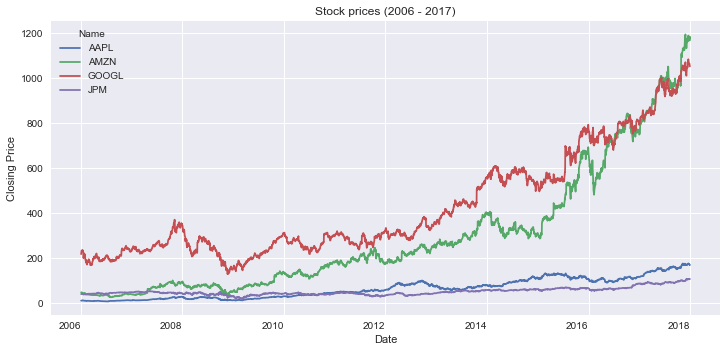
In this case, you’ll plot the closing price of four stocks over time.
You’ll start by preparing the data you’ll use in the graphs. Copy the following code in a new cell in your notebook:
url = "https://raw.githubusercontent.com/szrlee/Stock-Time-Series-Analysis/master/data/all_stocks_2006-01-01_to_2018-01-01.csv"
df = pd.read_csv(url)

df = df.loc[df.Name.isin(["AAPL", "JPM", "GOOGL", "AMZN"]), ["Date", "Name", "Close"]]
df["Date"] = pd.to_datetime(df.Date)
df.rename(columns={"Close": "Closing Price"}, inplace=True)
This code will prepare the data you’ll use in the plots. It works as follows:
- Lines 1-2: you read the data from an URL.
- Line 4: you filter the DataFrame object to include only the stocks that you want to plot.
- Line 5: you adjust the type of the Date column. Using
datetimewill make most plotting libraries set the tickers in a better way. - Line 6: you rename the Close column.
Next, you’ll make a line plot using this dataset.
Line Plot Using pandas
This is the code to make a line plot using pandas:
This code generates a line plot. There are two important details that you should take into account:
- Line 1: you use the pivot method to go from a long dataset to a wide one. To plot multiple series in
pandasyou need a wide dataset. - Lines 2-3: you create the plot. You set the size of the figure by using
figsizeand keep the x-axis ticks in a horizontal position by settingrot=0.
Here’s the resulting graph:
Line Plot Using matplotlib
Here’s how you create a line plot with matplotlib:
This code creates a line plot. Here are some relevant highlights:
- Line 1: you create a figure and axes objects, and set the size of the plot. The figure is a container for the axes. You draw the plot in the axes.
- Lines 3-4: you iterate over the groups in the
DataFrame. Each group is a tuple of the name of the stock and a series with its closing prices. You plot the closing prices of each stock on a separate series. - Lines 6-9: you set the labels, title, and show the legend of the plot.
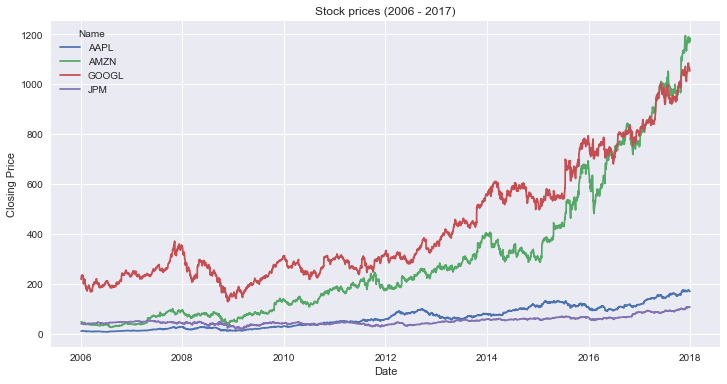
This is the resulting graph:
Line Plot Using seaborn
Here’s the code to create a line plot with seaborn:
This code creates a line plot using seaborn. Here’s what it does:
- Line 1: You start by creating a figure and axes objects and setting the size of the plot. T
- Lines 2-3: you create the graph and set its title.
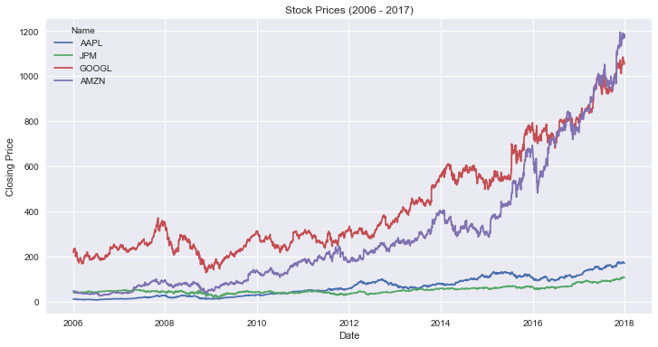
Here’s the resulting graph:
Line Plot Using plotly.express
This is how you use plotly.express to create a line plot:
Here’s the resulting graph:
How to Make a Grouped Bar Chart
A grouped bar chart is like a regular bar chart, but plots values for two categories instead of one. You can use grouped bars when you want to compare how a second category changes within each level of the first.
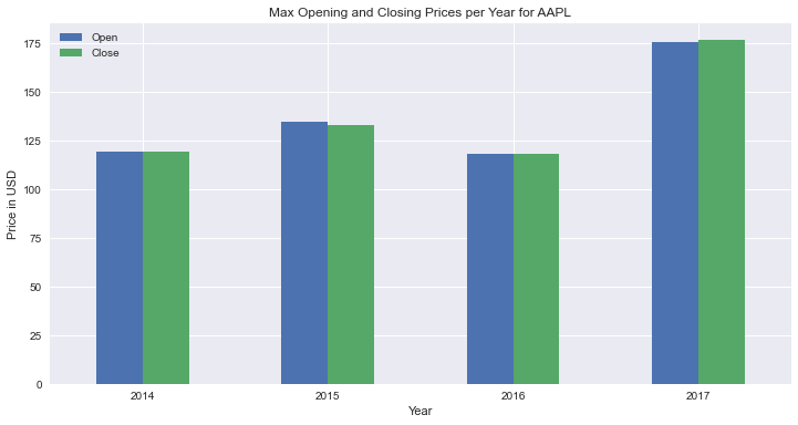
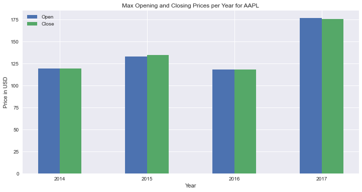
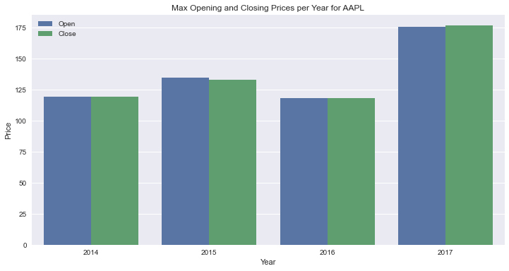
In this case, you’ll plot the maximum opening and closing price per year for Apple’s stock (AAPL) between 2014 and 2017.
You’ll start by preparing the data for the graphs. Copy the following code in a new cell in your notebook:
url = "https://raw.githubusercontent.com/szrlee/Stock-Time-Series-Analysis/master/data/all_stocks_2006-01-01_to_2018-01-01.csv"
df = pd.read_csv(url)

df = df.loc[df.Name == "AAPL", ["Date", "Open", "Close"]]
df["Year"] = pd.to_datetime(df.Date).dt.year
df = df.query("Year >= 2014").groupby("Year").max().reset_index(drop=False)
This code will prepare the data you’ll use in the plots. It works as follows:
- Lines 1-2: you read the data from an URL.
- Line 4: you keep the information of AAPL and the columns Date, Open, and Close.
- Line 5: youcreate a new column with the year of each data point.
- Line 6: you remove the observations from before 2014, and find the max value per year of each column in the
DataFrame.
Next, you’ll see how to make a grouped bars plot using this dataset.
Grouped Bar Chart Using pandas
Here’s the code to make a grouped bar plot with pandas:
This is how you make a grouped bar plot. There’s one detail worth mentioning: in the plot method, you set the size of the figure using figsize and keep the x-axis ticks in a horizontal position by setting rot=0.
Here’s the resulting graph:
Grouped Bar Chart Using matplotlib
Here’s the code to make a grouped bar plot using matplotlib:
fig, ax = plt.subplots(figsize=(12, 6))

x = np.arange(len(df.Year))
width = 0.25

ax.bar(x - width / 2, df.Open, width, label="Open")
ax.bar(x + width / 2, df.Close, width, label="Close")

ax.set_xlabel("Year")
ax.set_ylabel("Price in USD")
ax.set_title("Max Opening and Closing Prices per Year for AAPL")

ax.set_xticks(x)
ax.set_xticklabels(df.Year)

ax.legend()
This code will create a grouped bar plot using matplotlib. Here’s how it works:
- Line 1: you create a figure and axes objects, and set the size of the plot. The figure is a container for the axes. You draw the plot in the axes.
- Lines 3-4: you create
xto set the position of the ticks of thex-axis. In addition, you setwidthto 0.25, to define the width of the bars. - Lines 6-7: you create the bars at each tick in the x axis, taking in consideration the width of the bars.
- Lines 9-11: you set the labels and title of the plot.
- Lines 13-14: you set the locations and labels of the x-axis ticks.
- Line 16: you create a legend for the chart.
Here’s is the resulting graph:
Grouped Bar Chart Using seaborn
Here’s the code to make a grouped bar plot using seaborn:
df_long = df.melt(
    id_vars="Year",
    value_vars=["Open", "Close"],
    var_name="Category",
    value_name="Price",
)

fig, ax = plt.subplots(figsize=(12, 6))
sns.barplot(data=df_long, x="Year", y="Price", hue="Category", ax=ax)

ax.set_title("Max Opening and Closing Prices per Year for AAPL")
ax.legend(title=None)
This is how you make a grouped bars plot using seaborn. There are two details worth mentioning:
- Lines 1-6: you apply the
meltmethod to transform the original dataset into a long one (in regards to the closing and opening prices).seaborndoesn’t work well with wide datasets. - Line 7: you start by creating a figure and axes objects and setting the size of the plot. You’ll pass the axes to the
axparameter ofbarplot.
This is the resulting graph:
Grouped Bar Chart Using plotly.express
Here’s the code to make a grouped bar plot using plotly.express:
This is how you make a grouped bars plot using plotly.express. There are a few things worth highlighting:
- Line 4: to plot the opening and closing prices, you specify both in the
yparameter ofpx.bar.plotly.expressworks well with wide datasets, so you don’t need to reshape theDataFrame. - Line 6: you set
barmode=groupinpx.barso that bars don’t get stacked on top of each other.
This is the resulting graph:
How to Make a Stacked Bar Chart
A stacked bar chart is like a normal bar chart, except a normal bar chart shows the total of all the bars, and a stacked bar chart shows the total of all the bars, plus how each part of the bar is made up.
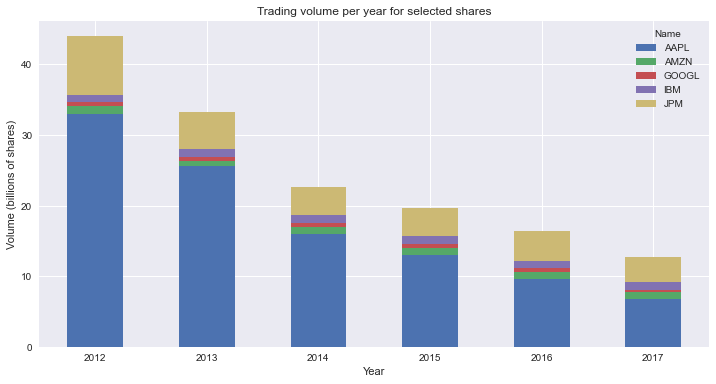
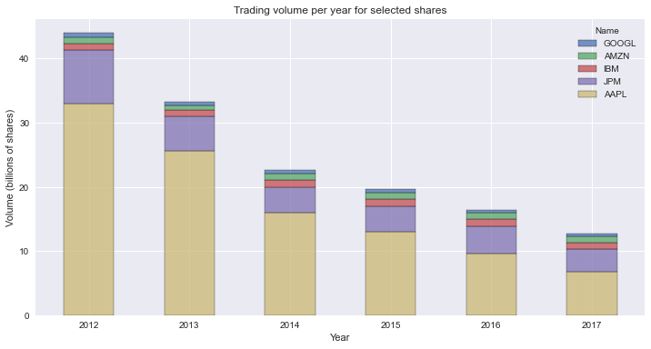
In this case, you’ll plot the total volume traded per year for a sample of stocks: AAPL, JPM, GOOGL, AMZN,and IBM.
First, you’ll prepare the data for the graphs. Copy this code in a cell in your notebook:
url = "https://raw.githubusercontent.com/szrlee/Stock-Time-Series-Analysis/master/data/all_stocks_2006-01-01_to_2018-01-01.csv"
df = pd.read_csv(url)

stocks_filter = ["AAPL", "JPM", "GOOGL", "AMZN", "IBM"]
df = df[df.Name.isin(stocks_filter)]
df["Date"] = pd.to_datetime(df.Date)
df["Year"] = pd.to_datetime(df.Date).dt.year
df["Volume"] = df["Volume"] / 1e9

df = (
    df[["Year", "Volume", "Name"]]
    .query("Year >= 2012")
    .groupby(["Year", "Name"])
    .sum()
    .reset_index(drop=False)
)
This code will help you prepare the data for the plots. It works as follows:
- Lines 1-2: you read the data from an URL.
- Lines 4-5: you keep the rows for the AAPL, JPM, GOOGL, AMZN, IBM.
- Line 6: youcreate a new column with the year of each data point.
- Line 9: you divide the total volume by one billion to make it more tractable.
- Line 6: you sum the volume per stock and year to get the total traded per year for each stock symbol.
Next, you’ll see how to make a stacked bar plot using this dataset.
Stacked Bar Chart Using pandas
Here’s the code to make a **stacked bar** plot using pandas:
There are a few details worth mentioning:
- Line 1: you use the pivot method to go from a long dataset to a wide one. To plot multiple series in
pandasyou need a wide dataset. - Lines 3-4: you set the size of the figure by using
figsizeand keep the x-axis ticks horizontally by settingrot=0. - Line 7: you set
stacked=True, so that bars get stacked instead of grouped together.
This is the resulting graph:
Stacked Bar Chart Using matplotlib
Here’s the code to make a **stacked bar** plot using matplotlib:
fig, ax = plt.subplots(figsize=(12, 6))

bottom = np.zeros(df.Year.nunique())
for i, g in df.groupby("Name"):
    ax.bar(g["Year"], g["Volume"], bottom=bottom, label=i, width=0.5)
    bottom += g["Volume"].values

ax.set_title("Trading volume per year for selected shares")
ax.set_ylabel("Volume (billions of shares)")
ax.set_xlabel("Year")

ax.legend()
This code will create a stacked bar plot using matplotlib. Here’s how it works:
- Line 1: you create a figure and axes objects, and set the size of the plot. The figure is a container for the axes. You draw the plot in the axes.
- Lines 3: you initialize an array filled with zeroes of the same size of the number of ticks in the x-axis.
- Lines 4-6: you iterate over groups in the
DataFrame. Each group is a tuple of the name of the stock and a series with its volume per date. You add a bar plot of the Volume to the axes. At each iteration,bottomaccumulates the total volume. You use it to stack the bars on top of each other. - Lines 8-12: you set the labels, title, and create a legend for the plot.
This is the resulting graph:
Stacked Bar Chart Using seaborn
Here’s how you make a **stacked bar** plot using seaborn:
fig, ax = plt.subplots(figsize=(12, 6))

ax = sns.histplot(
    data=df,
    x="Year",
    hue="Name",
    weights="Volume",
    multiple="stack",
    shrink=0.5,
    discrete=True,
    hue_order=df.groupby("Name").Volume.sum().sort_values().index,
)

ax.set_title("Trading volume per year for selected shares")
ax.set_ylabel("Volume (billions of shares)")

legend = ax.get_legend()
legend.set_bbox_to_anchor((1, 1))
This code will make a stacked bars plot in seaborn. There are some details worth mentioning:
- Line 1: you create a figure and axes objects, and set the size of the plot. The figure is a container for the axes. You draw the plot in the axes.
- Line 7: you set the size of the slices in the stacked bars by using the
weightsargument. In this case, you set the size of slices to the total volume of each stock. - Line 8-10: you allow stacking the bars by setting
multiple="stack". In addition, you reduce the width of the bars usingshrink=0.5, and center the bars in the ticks of the x-axis usingdiscrete=True. - Line 11: you set the order for the stacking of the bars. In this case, you draw the bars from biggest to smallest, starting from the bottom.
This is the resulting graph:
Stacked Bar Using plotly.express
Here’s how you make a stacked bars plot using plotly.express:
As you can see, making a stacked bars plot using plotly.express is straightforward. Just remember to set barmode="stack".
This is the resulting graph:
How to Make a Stacked Area Chart
The stacked area chart is a non-discrete version of a stacked bar chart. It’s useful when you want to visualize changes in the total value of a variable and its composition, in the same graph. Though, it’s often used to visualize only changes of composition over time.
In this case, you’ll plot the changes in the composition of the daily volume traded for a sample of stocks: AAPL, JPM, GOOGL, AMZN,and IBM.
Start by preparing the data for the graphs using this code:
url = "https://raw.githubusercontent.com/szrlee/Stock-Time-Series-Analysis/master/data/all_stocks_2006-01-01_to_2018-01-01.csv"
df = pd.read_csv(url)

stocks = ["AAPL", "AMZN", "GOOGL", "IBM", "JPM"]
df = df.loc[df.Name.isin(stocks), ["Date", "Name", "Volume"]]
df["Date"] = pd.to_datetime(df.Date)
df = df[df.Date.dt.year >= 2017]
df["Volume Perc"] = df["Volume"] / df.groupby("Date")["Volume"].transform("sum")
This code will help you prepare the data for the plots. It works as follows:
- Lines 1-2: you read the data from an URL.
- Lines 4-5: you keep the rows for the AAPL, JPM, GOOGL, AMZN, IBM.
- Line 6-7: youkeep the data for 2017 onwards.
- Line 6: you calculate the percentage of the total volume traded corresponding to each stock symbol.
Next, you’ll see how to make a stacked area plot using this dataset.
Stacked Area Chart Using pandas
Here’s how you make a stacked area plot using pandas:
This code will make a stacked area plot using pandas. There are a few details worth mentioning:
- Line 1: you use the pivot method to go from a long dataset to a wide one. To plot multiple series in
pandasyou need a wide dataset. - Lines 4-5: you set the size of the figure by using
figsizeand keep the x-axis ticks horizontally by settingrot=0. - Line 7: you set
stacked=Trueto stack the areas. - Lines 9-10: you move the legend to the upper left corner, and set format the y-axis tick labels to use percentages.
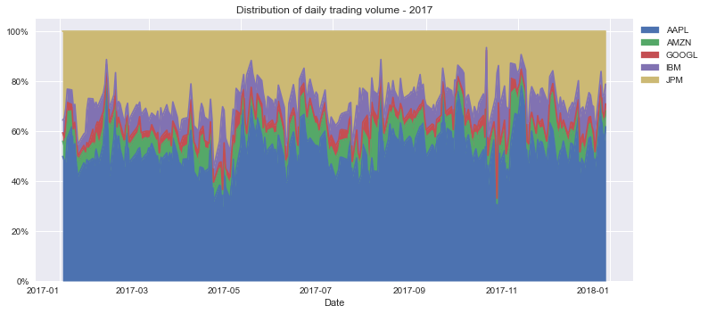
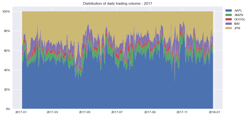
This is the resulting graph:
Stacked Area Chart Using matplotlib
Here’s how you make a stacked areas plot using matplotlib:
df_wide = df.pivot(index="Date", columns="Name", values="Volume Perc")

fig, ax = plt.subplots(figsize=(12, 6))

ax.stackplot(df_wide.index, [df_wide[col].values for col in stocks], labels=stocks)
ax.legend(bbox_to_anchor=(1, 1), loc="upper left")

ax.set_title("Distribution of daily trading volume - 2017")
ax.yaxis.set_major_formatter(mtick.PercentFormatter(1))- Line 1: you use the pivot method to go from a long dataset to a wide one. For this type of chart in
matplotlib, is better to use a wide dataset. - Line 3: you create a figure and axes objects, and set the size of the plot. The figure is a container for the axes. You draw the plot in the axes.
- Line 5: you create the plot by passing it the values for the x-axis, a list of lists for the areas, and the labels for each series.
- Lines 4-6: you iterate over groups in the
DataFrame. Each group is a tuple of the name of the stock and a series with its volume per date. At each iteration, you add a bar plot of the volume to the axes and sum the volume values tobottom. You usebottomto set the distance between the bars and the x-axis. - Lines 8-12: you set the labels, title, and create a legend for the plot.
This is the resulting graph:
Stacked Area Chart Using plotly.express
Here’s how you make a stacked area plot using plotly.express:
This is the resulting graph:
How to Make a Pie or Donut Chart
The pie or donut chart shows the composition of a variable into categories by using radial slices. For example, you could use it to show what percentage of your day you dedicate to sleep, work, and leisure.
In this case, you’ll plot the distribution of the total volume traded for a sample of stocks: AAPL, JPM, GOOGL, AMZN,and IBM.
Start by preparing the data for the graphs using this code:
url = "https://raw.githubusercontent.com/szrlee/Stock-Time-Series-Analysis/master/data/all_stocks_2006-01-01_to_2018-01-01.csv"
df = pd.read_csv(url)

stocks_filter = ["AAPL", "JPM", "GOOGL", "AMZN", "IBM"]
df = df.loc[df.Name.isin(stocks_filter), ["Name", "Volume"]]
df = df.groupby("Name").sum().reset_index()
This code will help you prepare the data for the plots. It works as follows:
- Lines 1-2: you read the data from an URL.
- Lines 4-5: you keep the rows for the AAPL, JPM, GOOGL, AMZN, IBM.
- Line 6: you sum the total volume per stock for the whole dataset.
Next, you’ll see how to make a pie or donut plot using this dataset.
Pie or Donut Chart Using pandas
Here’s the code to make a donut chart using pandas:
You can use this code to create a pie or donut chart using pandas. Here’s how it works:
- Line 1: you set Name as the
DataFrameindex. This is needed if you want to make a pie or donut chart withpandas. Then, you callplot.pie. - Line 2: you use Volume to calculate the size of the radial slices.
- Line 3-7: you create the “hole” in the pie, set the figure size, define the format and location of the labels, and set the title of the chart.
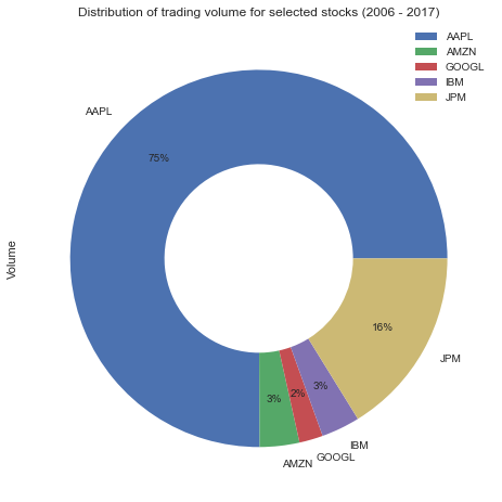
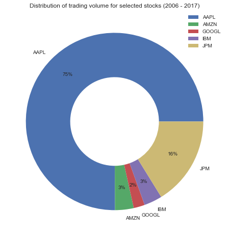
This is the resulting graph:
Pie or Donut Chart Using matplotlib
Here’s how you make a donut chart using matplotlib:
This is code will create a donut chart with matplotlib. Here’s how it works:
- Line 1: you create a figure and axes objects, and set the size of the plot. The figure is a container for the axes. You draw the plot in the axes.
- Line 4-5: you use Volume to calculate the size of the radial slices and use Name for the labels.
- Line 6-11: you define the size of the “hole” in the pie, define the format and location of the labels, set the title, and create the legend of the chart.
This is the resulting graph:
Pie or Donut Chart Using plotly.express
Here’s how you make a donut chart using plotly.express:
This code will result in the following graph:
How to Make a Histogram
A histogram shows the distribution of a numerical variable using bars. Each bar’s height indicates the frequency of a certain range of that numerical variable. You can use a histogram to evaluate attributes such as shape, skew, and outliers of a variable.
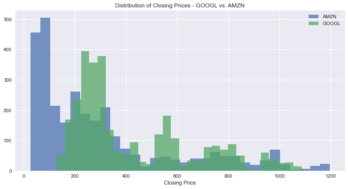
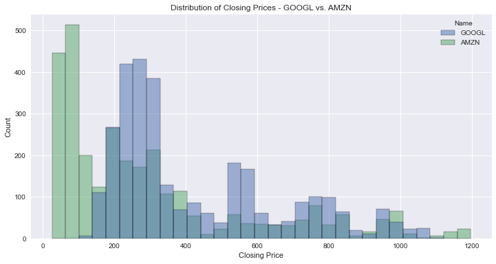
In this case, you’ll make a histogram with the distribution of closing prices of GOOGL and AMZN. Note that plotting a histogram with a single group is trivial, so I chose to create one for multiple groups.
Start by preparing the data for the graphs using this code:
This code will help you prepare the data for the plots. Here’s how it works:
- Lines 1-2: you read the data from an URL.
- Lines 4-5: you keep the rows for the GOOGL and AMZN, and the columns you’ll use in the plot.
Next, you’ll see how to make a histogram using this dataset.
Histogram Using pandas and matplotlib
Here’s how you make a histogram with multiple groups using matplotlib:
fig, ax = plt.subplots(figsize=(12, 6))

for i, (l, g) in enumerate(df.groupby("Name")):
    if i == 0:
        _, bins, _ = ax.hist(g.Close, alpha=0.75, label=l, bins=30)
    else:
        ax.hist(g.Close, alpha=0.75, label=l, bins=bins)

ax.legend()
ax.set_title("Distribution of Closing Prices - GOOGL vs. AMZN")
ax.set_xlabel("Closing Price")
You use this code to create a histogram with multiple groups. Here’s what it does:
- Line 1: you create a figure and axes objects, and set the size of the plot. The figure is a container for the axes. You draw the plot in the axes.
- Line 3-7: you iterate over the groups in the
DataFrame. Each group is a tuple of the name of the stock and a series with its closing prices. In addition, you useenumerateto identify the index of each group. You use the first group (index 0), to calculate how many bins you’ll use in the histogram. - Line 9-11: you create the legend of the chart, set the title, and set label of the x-axis.
This is the resulting graph:
Histogram Using seaborn
Here’s how you make a histogram using seaborn:
There’s one detail worth mentioning: in the first line, you create a figure and axes objects (the latter you pass to the histplot method) and set the size of the plot. The figure is a container for the axes. You use the axes to draw the plot.
This is the resulting graph:
Histogram Using plotly.express
Here’s how you make a histogram using plotly.express:
This is the resulting graph:
How to Make a Scatter Plot
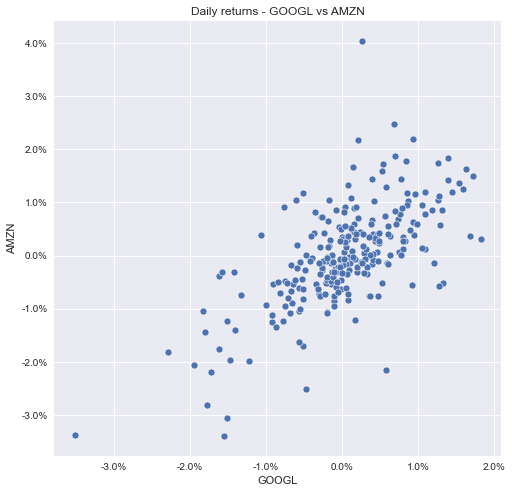
A scatter plot consists of dots graphed in a space defined by a horizontal and a vertical axis. You can use it to understand the relationship between two variables. For example, the relationship between height and weight for a group of individuals.
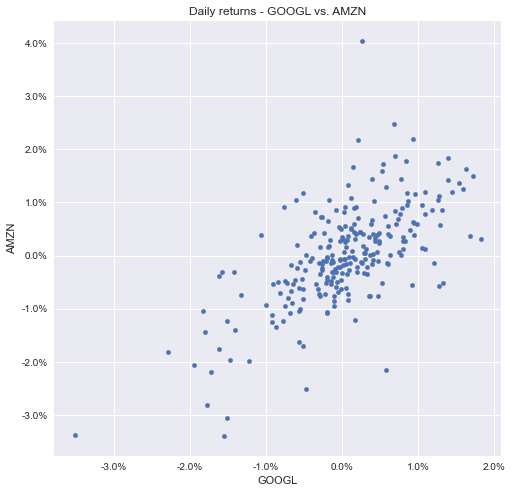
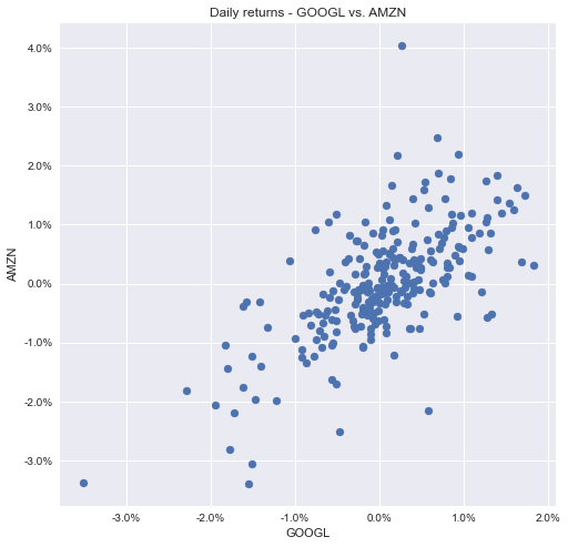
For this part of the tutorial, you’ll make a scatter plot with the daily returns of GOOGL and AMAZN.
In the code below, you prepare the data to create the graphs:
url = "https://raw.githubusercontent.com/szrlee/Stock-Time-Series-Analysis/master/data/all_stocks_2006-01-01_to_2018-01-01.csv"
df = pd.read_csv(url)

stocks_filter = ["GOOGL", "AMZN"]
df = df.loc[
    (df.Name.isin(stocks_filter)) & (pd.to_datetime(df.Date).dt.year >= 2017),
    ["Date", "Name", "Open", "Close"],
]
df["Return"] = (df["Close"] - df["Open"]) / df["Open"]
df_wide = df.pivot(index="Date", columns="Name", values="Return")
In this code snippet, you read and transformed the data. It works as follows:
- Lines 1-2: you read the data from an URL.
- Lines 4-8: you remove the rows and columns you don’t need from the
DataFrame. - Line 9: You calculate the intraday return per day for each stock.
- Line 10: You transform the dataset from long to wide. The resulting dataset will have two columns with the intraday returns for AMZN and GOOGL.
Scatter Plot Using pandas
In the code below, you’ll see how to make a scatter plot with pandas:
This is the resulting graph:
Scatter Plot Using matplotlib
Here’s how you make a scatter plot using matplotlib:
import matplotlib.ticker as mtick

fig, ax = plt.subplots(figsize=(8, 8))

ax.scatter(x=df_wide["GOOGL"], y=df_wide["AMZN"])

ax.set_xlabel("GOOGL")
ax.set_ylabel("AMZN")
ax.set_title("Daily returns - GOOGL vs. AMZN")

ax.yaxis.set_major_formatter(mtick.PercentFormatter(1))
ax.xaxis.set_major_formatter(mtick.PercentFormatter(1))
This is the resulting graph:
Scatter Plot Using seaborn
Here’s how you make a scatter plot using seaborn:
This is the resulting graph:
Scatter Plot Using plotly.express
Here’s how you make a scatter plot using plotly.express:
This is the resulting graph:
How to Make a Box Plot
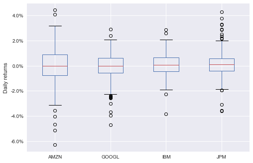
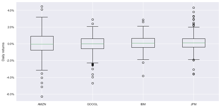
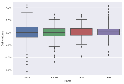
A box plot shows you a statistical summary of a dataset through a graphical representation of quartiles. It shows the following information of the variable studied:
- Minimum
- Maximum
- Median
- Q1 (first quartile)
- Q3 (third quartile)
- Outliers
In this case, you’ll create a boxplot of the intraday of 2016 for a sample of stocks: AAPL, GOOGL, IBM, andJPM.
Start by preparing the data for the graphs using this code:
url = "https://raw.githubusercontent.com/szrlee/Stock-Time-Series-Analysis/master/data/all_stocks_2006-01-01_to_2018-01-01.csv"
df = pd.read_csv(url)

stocks = ["AMZN", "GOOGL", "IBM", "JPM"]
df = df.loc[
    (df.Name.isin(stocks)) & (pd.to_datetime(df.Date).dt.year == 2016),
    ["Date", "Name", "Close", "Open"],
]
df["Return"] = (df["Close"] - df["Open"]) / df["Open"]
df["Date"] = pd.to_datetime(df.Date)
This code will help you prepare the data for the plots. It works as follows:
- Lines 1-2: you read the data from an URL.
- Lines 4-8: you keep the information for the stocks that interest you and remove data that’s not from 2016. In addition, you drop the columns you don’t need for the plots.
- Line 9: you calculate the intraday return of each stock.
- Line 10: you set the correct data type to Date.
Next, you’ll see how to make a box plot using this dataset.
Box Plot Using pandas
Here’s how you make a box plot using pandas:
There are a few details worth mentioning:
- Line 1: you use the pivot method to go from a long dataset to a wide one. To plot multiple series in
pandasyou need a wide dataset. - Line 2: you create the plot. You specify which columns of the dataset should be used for the boxplot.
- Lines 4-5: you set the label of the y-axis, and change the format of the ticks of the y-axis to show percentages.
This is the resulting graph:
Box Plot Using matplotlib
Here’s how you make a box plot using matplotlib:
df_wide = df.pivot(index="Date", columns="Name", values="Return")

fig, ax = plt.subplots(figsize=(12, 6))

stocks = ["AMZN", "GOOGL", "IBM", "JPM"]
ax.boxplot([df_wide[col] for col in stocks], vert=True, autorange=True, labels=stocks)

ax.set_ylabel("Daily returns")
ax.yaxis.set_major_formatter(mtick.PercentFormatter(1))- Line 1: you use the pivot method to transform the dataset from long to wide.
- Line 3: you create a figure and axes objects, and set the size of the plot. The figure is a container for the axes. You draw the plot in the axes.
- Line 6: you create the plot by passing a list of lists with the values of the Daily returns of each stock.
- Lines 8-9: you set the label of the y-axis, and change the format of the ticks of the y-axis to show percentages.
This is the resulting graph:
Box Plot Using seaborn
Here’s how you make a box plot using seaborn:
There’s one detail worth highlighting: on lines 3 and 4, you set the label of the y-axis, and change the format of the ticks of the y-axis to show percentages.
This is the resulting graph:
Box Plot Using plotly.express
Here’s how you make a box plot using plotly.express:
This is the resulting graph:
Conclusion
In this tutorial, you’ve learned how to make some of the most popular types of charts with four data visualization libraries in Python: pandas, matplotlib, seaborn, and plotly.express.
You understood the strengths and weaknesses of each data visualization library, and learned how to make the following type of graphs:
- Line plots
- Grouped and stacked bar charts
- Area charts
- Pie/donut charts
- Histograms
- Box plots
- Scatter plots
I hope you’ve found this tutorial helpful. If you have any questions or feedback, please let me know in the comments!
Citation
@online{castillo2021,
  author = {Castillo, Dylan},
  title = {How to {Plot} with {Python:} 8 {Popular} {Graphs} {Made} with
    Pandas, Matplotlib, Seaborn, and Plotly.express},
  date = {2021-07-03},
  url = {https://dylancastillo.co/posts/how-to-plot-with-python-popular-graphs-using-pandas-matplotlib-seaborn-and-plotly-express.html},
  langid = {en}
}
